Caffe Vita
Interactive SIte
You can hover your mouse to interact with these text boxes. On moble simply tap on the box to reveal the interaction and information within the text box.
Thank You
Please Enjoy this interactive experience and use it to reveal all of the content that's on the page.
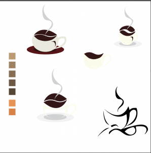
Original
Rebrand
OBJECTIVE: BRAND REDESIGN
This brand is originally located in Seattle, then spread their business to many popular locations Pacific Northwest. The Pacific Northwest was where, I drew most of my inspiration from, since it was the lifestyle Caffe Vita was trying to sell. The First notable thing about the brand, was that it had a very unsettling logo appearance.
After polling random people, I found most people felt that the old logo, had a very unsettling image behind it. Weeks of working on the project me and my partner were unable to figure out the inspiration behind the logo, and felt it was unnecessary to keep its original aesthetic.
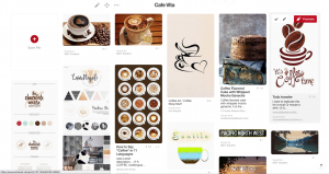
Instead, I went forward to look at Pinterest to begin to looking into different inspirations for the brand I was going to create. Coffee and the North west lifestyle were the main principle behind the inspiration.
THE INSPIRATION
I pulled it from their mission statement which was: “creating an environment where the customer can see, touch, and taste the coffee they purchase, we provide a unique learning opportunity that allows our coffee to speak for itself.
Caffe Vita is always fresh, imported directly from the farm and roasted on-site.”
From this the main objective was to capture the freshness coffee quality Caffe Vita was trying to express to their customers.
Research
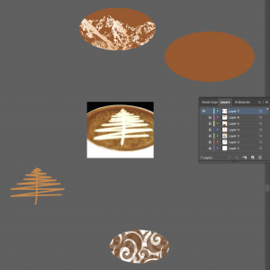
I googled: Pacific Northwest, and found myself surfing through many images of mountains and pine trees, so using a Pine tree drizzle, relates back to the lifestyle that Caffe Vita is trying to sell.
A tree being a very fresh symbol, can really affirm the fact that Caffe Vita is trying to sell a very organic and natural coffee to their customers.
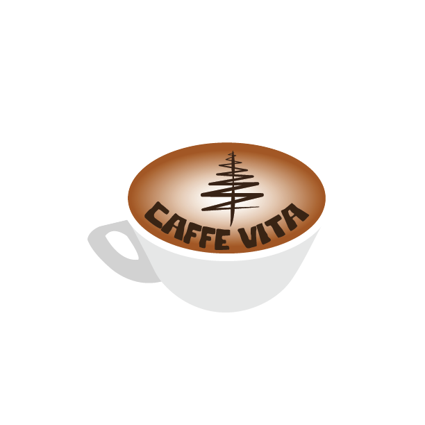
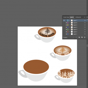
With all the inspiration I came up with the logo of a elegant cup of coffee with a foamy center and caramel drizzle of a pine tree.
THE RESULTS
Using The drizzle alone next to the name Caffe vita is enough to associate the image to the brand. The warm and cream browns of coffee were all used as inspiration for the rebranding color scheme.
Conclusion
I am very satisfied with the final results, and I believe it really shows off my skills and what kind of work I can attribute to a digital graphics marketing team.